typography


édifice
Workshop «Archipolis» avec les typographes Émilie Rigaud & Vincent Desclaux.
Brief :
Créer une police de caractères de labeur, à partir du travail d’un·e architecte.
>> Dessin des caractères, numérisation sur Glyph, création d’une affiche spécimen et d’une affiche animée en réalité augmentée, réalisation de l’animation (morphing).
Nous avons été inspirés par les bâtiments courbés et anguleux de Frank Gehry : notamment, le musée Guggenheim à Bilbao et le Walt Disney Concert Hall à Los Angeles.
Malgré la nature excentrique des bâtiments de Frank Gehry, le brief stipulait bien la création d’un caractère de labeur et non de display : c’est‐à‐dire, qui peut être lu aisément dans un bloc de texte. Nous avons donc créé un caractère lisible, tout en nous inspirant des courbes élancées et des angles de nos bâtiments d’inspiration.
“Archipolis” workshop with typographers Émilie Rigaud (A is for fonts) & Vincent Desclaux.
Create a typeface for a body of text, based around the work of an architect.
>> Drawing of character set, digitization on Glyphs, creation of a specimen poster and an animated poster in augmented reality, creation of animation (morphing).
We were inspired by Frank Gehry's architectural projects, such as the Guggenheim Museum in Bilbao and the Walt Disney concert hall in Los Angeles. Despite the excentric and angular nature of Gehry's buildings, the brief stipulated the need for a text font, as opposed to a display font. We decided as a group to create a legible font inspired by the sharp angles and slender curves of the buildings that inspired us.
Inclusive typography
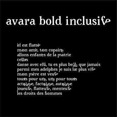
Two or more letters combined into one character make a ligature. In typography, some ligatures represent specific sounds or words such as the Æ or æ diphthong ligature. Other ligatures are more functional in nature, and are created to solve the problem of characters that crash when set next to each other.
In an effort to make the french language more gender-neutral, a new generation of graphic designers and typographers also use ligatures to create neutral or inclusive suffixes.
I have made my own ligatures for two fonts : avara bold and EB Garamond.
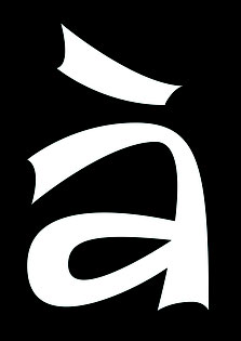
avara inclusive
Inclusive queer typography workshop with Roxanne Maillet from Bye Bye Binary collective.
An experimental workshop, designed for us students to discover inclusive ligatures and play with typography.
The "base font" had to be open source. According to its creators : "Avara is a transitional serif, curveless type family. The placement of its nodes is exclusively based on a rough square grid. The original reason of this design choice was to facilitate collaboration on the font, and it now results in the radical and highly constrained shapes of this type family. It was started and first released in November 2011 by Raphaël Bastide and has since been modified and completed by others.
claude

Bachelor's dissertation project.
Flash cards to learn inclusive queer ligatures.
I chose to work with Garamond, as it is classified as a garalde font in the Vox-Atypi classification. These well-balanced serif fonts were the tool used in 16th-century France to fix official grammar and spelling rules.